Drive Browser - Make Google Docs and Words Awesome Again (WIP)
Written on 2020-08
Disclaimer: There is no serious UX/Market research for this project, this is based on my personal preferences and biases.
There are tons of document collaborative tools nowadays: Google Docs, Microsoft Office, Notion, Coda, Quip, etc.
Recently, Google Docs and Microsoft Office seem to be left behind with the rise of modern doc tools such as Notion and Coda. (Microsoft does have a plan for their new collaborative office tool, Loop, but not sure when will it be released though).
My teams are using Notion / Coda as the main doc tools, however, we still have to use Google Docs and Microsoft Office frequently, at least for years, for a few reasons:
- More advanced sheets and presentations
- Clients are still using the tools
- We still have some legacy docs there (never have time to migrate them lol)
The traditional tools still have a well-established brand with huge ecosystems, I wonder if we can bring some experiences from Notion / Coda to improve the experience of the traditional collaborative doc tool, how would it become? Would there even be a comeback for these tools?
In this post, I will try love to bring some experiences from Notion and Coda to the traditional doc tool to see where it can go.
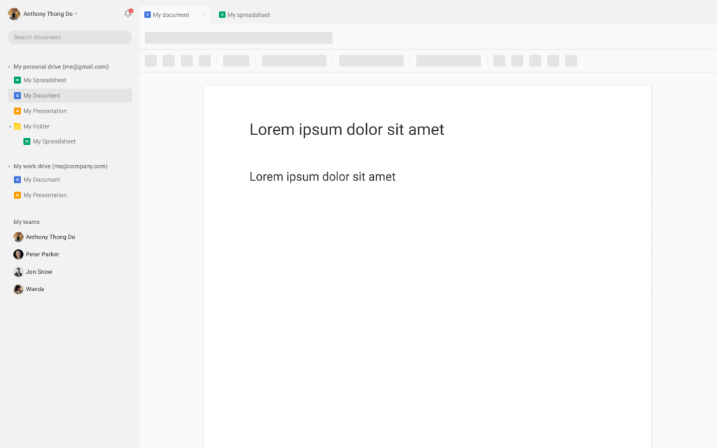
The Drive Browser
I will call it Drive Browser

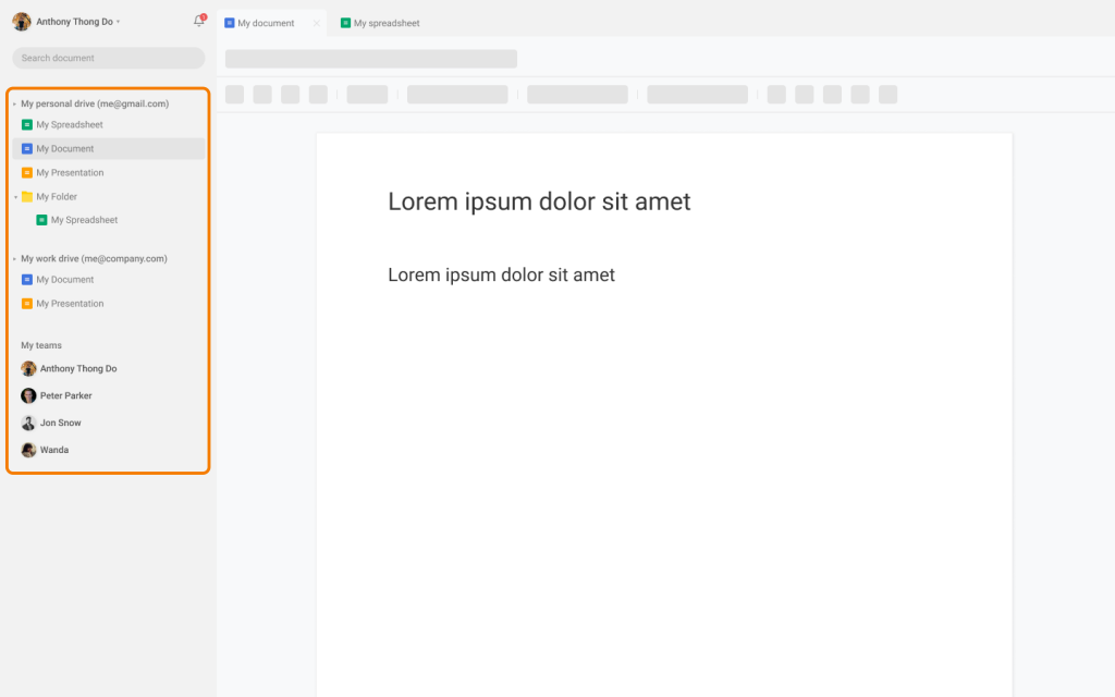
New navigation bar experience
Problem
The navigation bar experience is clumsy
- Slow performance
- Can't access files from the nav bar
- No tree-like nav bar (Onedrive)

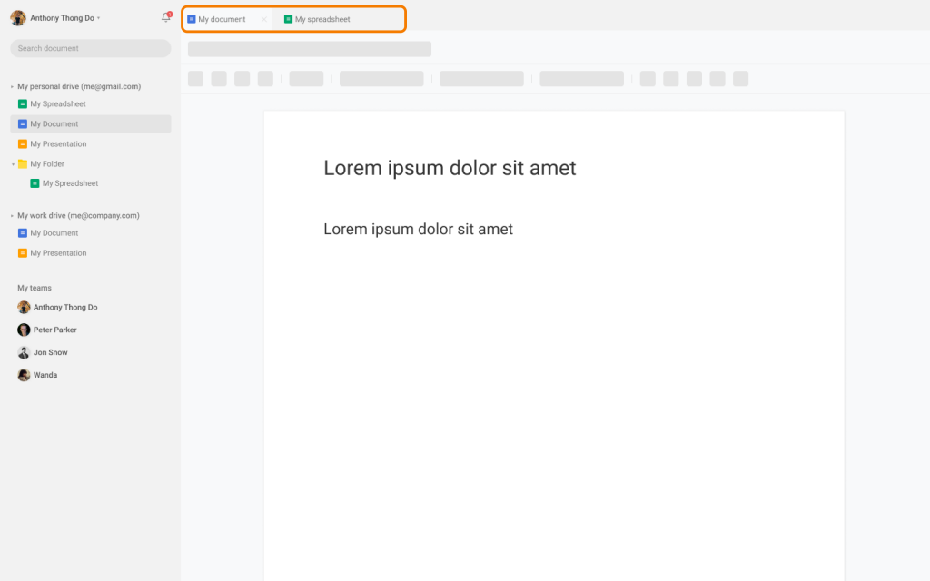
Tabs
This is nice to have

The Search
Better Collaboration
Centralized Notification System
The future of this proposal
I think Microsoft is trying to do it with Loop